Tasks experience revamp | May 2024
Enhancing Force tasking experience to empower our workforce and increase revenue.
How I redesigned one of the core features of the tasking experience, creating a more streamlined solution that better aligns with ABI's long-term business goals—boosting sales and enhancing task effectiveness.
Anheuser-Busch InBev (ABI) leads several digital innovations, and Force is a top solution for digitizing its commercial strategy. The app helps ABI and its partners ensure that Business Development Representatives (BDRs) follow the commercial strategy during their daily customer visits.
USER PROBLEM
BEES Force offers a unique advantage by translating strategic commercial OKRs—both global and local—into actionable tasks that sales representatives execute during their daily visits. However, the current app experience is confusing and fails to communicate this complex mechanism's underlying business rules effectively. As a result, sales teams struggle to understand how the tasking system works and what is expected of them to achieve commercial OKRs. This lack of clarity directly impacts task execution, leading to inefficiencies and reduced effectiveness.
The current tasking experience fails to clearly communicate what is expected of BDRs, particularly in terms of visit priorities. It introduces confusing concepts, hides valuable information and key features during negotiations.
Business Goals
Increase task effectiveness, particularly for portfolio-related tasks.
Ensure BDRs have all necessary resources within the app, reducing reliance on external materials.
Promote and optimize the execution of sales tasks.
IMPACT
As the senior designer on this project, I was responsible for the entire end-to-end process. I led product discovery alongside the product manager, developed research scripts, conducted interviews and usability tests, and delivered high-fidelity designs. Working with my team, I delivered:
20%
feature discoverability increase
14,88%
UMUX score increase
BACKGROUND
BEES Force is the primary work tool for our BDRs (Business Development Representatives), providing access to performance metrics, customer databases, and daily visit routes. The app uses an algorithm to recommend optimal routes and generate personalized tasks, ranging from simple operational duties to strategic sales-driven activities. This system allows ABI and its partners to translate high-level business strategies into actionable frontline execution. Currently, over 3,000 users rely on BEES Force daily, but critical experience gaps hinder its effectiveness.
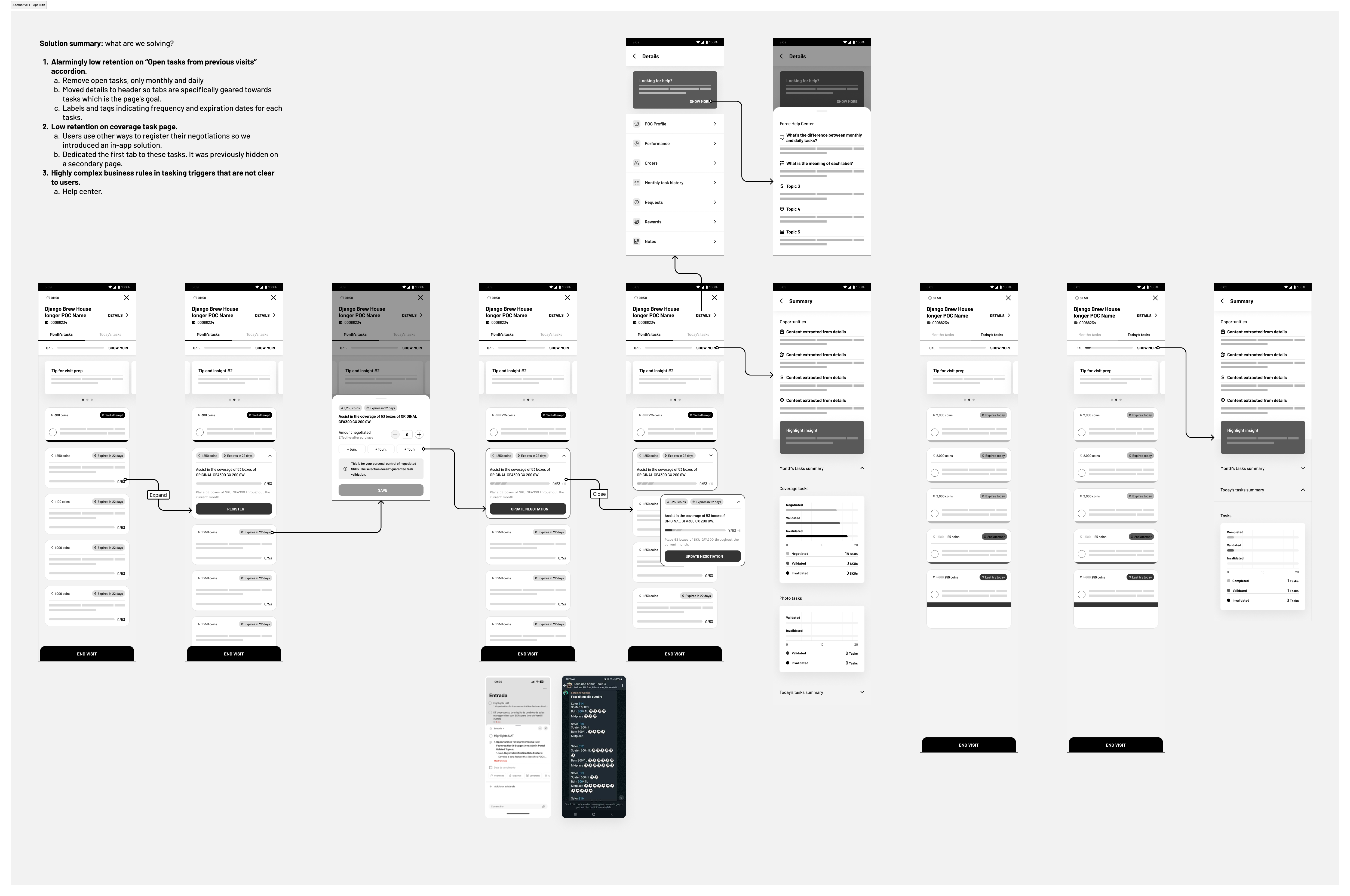
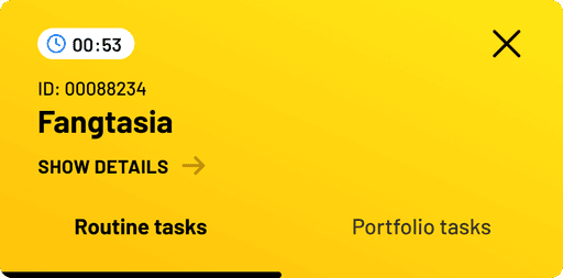
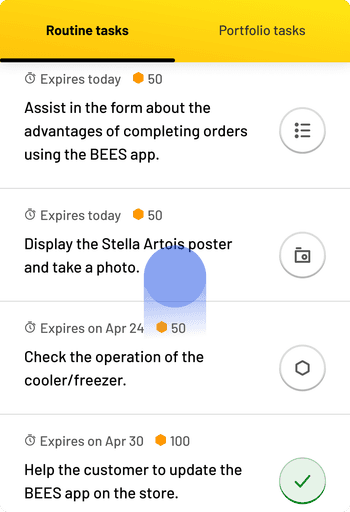
The current experience looks like this:

Some tasks from previous visits remained incomplete and were carried over to the next visit.
Each visit also has simple tasks to be performed. These range from small actions in-visit to more complex ones such as taking photos of the customer's store.
Discovery
The initiative to improve the tasking experience within Force was born from numerous user complaints and concerning data on feature usage. Additionally, the company experienced a decline in task effectiveness rates. To better understand the issue at hand, I collaborated with the product team to identify the key problems we needed to address in order to drive meaningful change.
Usage data
The metrics that sparked this initiative played a crucial role in ensuring the design process stayed aligned with business goals. Through data analysis, we uncovered key insights:
Only 7.45% of visits started between Dec 1st and Feb 29th (90 days) involved BDRs fully utilizing the coverage task page.
Just 1.9% of visits during the same period saw BDRs fully engaging with the open tasks from previous visits accordion.
The task-triggering mechanism is built on a complex set of criteria that isn’t clearly communicated in the app. Users have no visibility into the validation period or how the retriggering process works.
These insights shaped our hypotheses, which guided the rest of the discovery process:
Users may be relying on other sources of information, as they rarely access the coverage task page, even though it’s essential for completing these tasks and, somehow, they were still completing these tasks by the end of the month.
Users may face constraints that prevent them from completing all tasks within a single visit.
Interviews and survey
To better understand the challenges we were facing, I conducted a research study alongside the product team. I interviewed eight BDRs and surveyed over 800 respondents. This research validated many of the initial hypotheses while also uncovering new insights.
My conversations with users focused on three key areas:
The alternative resources they relied on besides Force.
Their overall perception of the Force experience.
Their approach to prioritizing tasks during visits, particularly how sales tasks were handled.
From these interviews and surveys, we discovered that 62.5% (5 out of 8) of the interviewed BDRs expressed a lack of trust in the app’s information and relied heavily on other sources to perform their tasks. Similarly, 61.6% (545 out of 884) of survey respondents indicated that their primary source of guidance was the morning meeting conducted by their Sales Manager.
These findings closely aligned with the quantitative data we had previously collected, reinforcing our understanding of the problem.
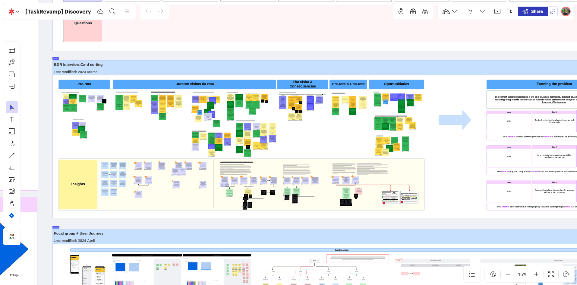
To make the most out of the interview data, I compiled the findings on Lucid and conducted a card sorting workshop with the product team to identify common themes. Additionaly, I framed the problems at hand.
Learnings
Users struggle with incomplete and outdated information, reliance on external materials, and poor information architecture that buries essential insights within secondary pages. The lack of a seamless, intuitive tasking experience hinders adoption and reduces the effectiveness of sales efforts.
Our discovery process provided valuable insights, allowing us to refine the problem we needed to solve. The key product definitions that guided us were:
The current tasking experience does not clearly define BDRs' priorities during visits. It introduces confusing concepts that make task execution more difficult.
It hides essential information and key features, particularly during negotiations.
Force is not perceived as a reliable source of truth by its users. They, somehow, still complete tasks by the end of the month, but using external material to guide them.
These issues collectively result in low adoption of the feature, ultimately reducing task effectiveness. By improving task visibility, streamlining information access, and positioning BEES Force as a reliable, up-to-date source of truth, we can empower BDRs to execute their tasks more efficiently and drive stronger commercial outcomes.
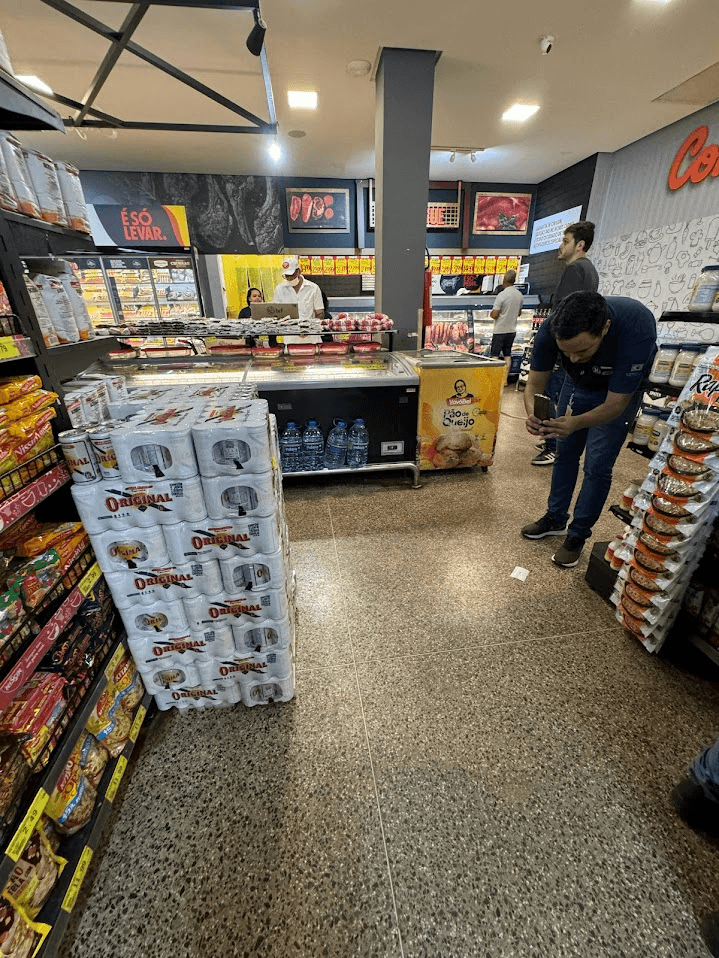
Alongside the research process, I joined several BDRs on their routes to observe their workflow and gain a deeper understanding of how they engage with our app.
Audit
To conclude the discovery phase, I conducted a comprehensive audit to pinpoint areas for improvement within the feature. By analyzing data from interviews, user shadowing, and surveys, I was able to identify key opportunities for enhancement. Here were my main findings:


When beginning a customer visit, the user's primary goal is to complete their assigned tasks efficiently. However, the design introduced unnecessary distractions by providing access to features that were rarely used. Since visits typically last only 10 minutes, there’s no time to review performance KPIs, for example. Data analysis confirmed that users rarely interacted with the Performance tab. Additionally, there was a hierarchy issue—Performance, Tasks, and Details were presented at the same level of importance, despite serving very different roles in the BDRs' workflow.
Uncompleted tasks from previous visits could carry over to the next one, but BDRs never fully understood the criteria for this process. Not all open tasks followed this behavior, leading users to disregard the accordion altogether.
The task cards also had interaction issues due to the "slide to complete" action. This gesture is native to iOS, yet all our users were on Android, making implementation complex and prone to issues. Furthermore, BDRs often used low-end phones, many with broken screens, making the slide gesture difficult to execute.
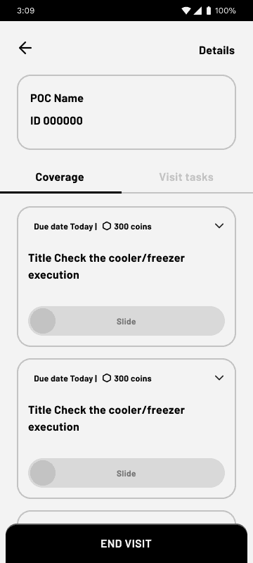
Tasks related to product sales were critical for business OKRs, yet they were buried within a secondary page. As a result, users rarely accessed them, instead relying on other sources to track their monthly goals. Additionally, the task cards themselves provided little valuable information about the task at hand.
DEFINE
Fleshing out the journey
By listing the issues I encountered during discovery, I was able to brainstorm potential solutions effectively. To quickly explore and refine ideas, I used wireflows as a key resource, particularly to improve communication with stakeholders. I held three sessions with the product team, and after each one, our product definitions became increasingly clear. Additionally, engineering was involved early in the process, ensuring we had valuable technical input from the start.
V1
V2
V3
V4
Each iteration played a key role in refining the final solution. After every new version, we held discussions with the product team to ensure alignment with business goals and product vision. Wireframing was essential for quickly evaluating the page's information architecture and exploring new interaction possibilities.
Validate
Usability tests
Once we had a solid version, we brought it to our users to gather their feedback. I designed a usability test script and led all the sessions. This included conducting five live sessions via Zoom with users in Brazil and running five unmoderated sessions through Lyssna with users in Mexico.
10
Participants
83,5%
Overall task success rate
I record each session so I can reference it later and take additional notes when needed.
For the usability test, our main hypothesis was that users would benefit from direct access to tasks rather than the additional information they rarely used. We also aimed to maintain consistent interactions across both task types within their respective tabs. Lastly, we sought to validate users' understanding of the wording, particularly how tasks were organized into two tabs.
Insights:
Users easily understood the proposed flow, and the visual emphasis on task status was well received. However, small font size and difficulty noticing interface changes were sources of frustration.
While users appreciated task progress tracking, they wanted better visibility of coverage tasks and more control over their personal tasks.
Users had no issues with the labeling of the tabs for routine and portfolio tasks.
The version that underwent testing was the result of thorough research and extensive discovery. I included many features that ultimately weren't prioritized for the final solution due to engineering constraints. However, most of these features were incorporated into phase 2 of the project.
How can we improve Force to empower BDRs and increase task effectiveness?
Solution
The goal is to emphasize tasks, as they are the user's primary focus during a customer visit—especially sales tasks, which are critical to business OKRs. Additionally, the experience must be designed with users' devices and real-world usage conditions in mind.
Highlight what is actually important
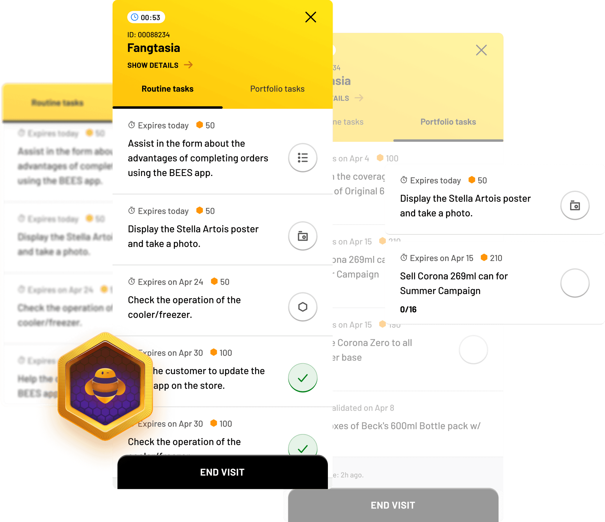
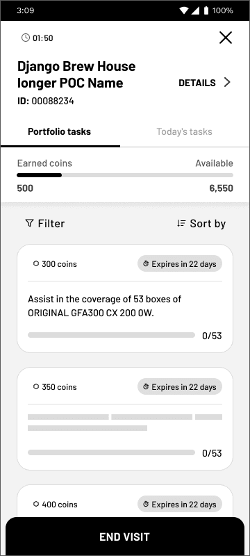
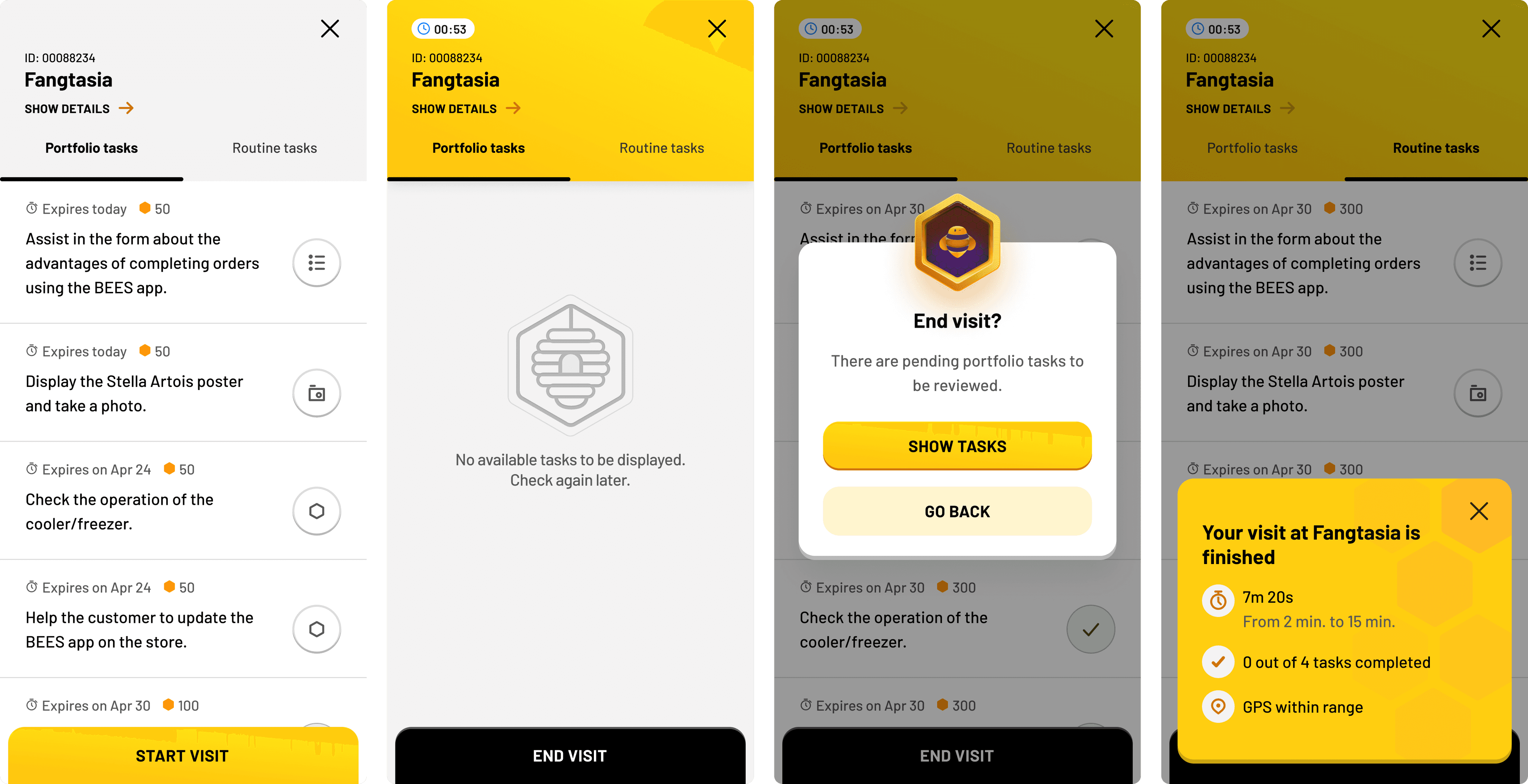
Task features should enable BDRs to take action directly from the main customer visit page, keeping them engaged and ensuring a seamless experience by minimizing unnecessary clicks. Instead of categorizing tasks by monthly and daily views, they should be divided into routine tasks and portfolio tasks, as these better align with the BDR journey. This approach helps users stay focused on high-impact features that drive revenue and digital adoption.
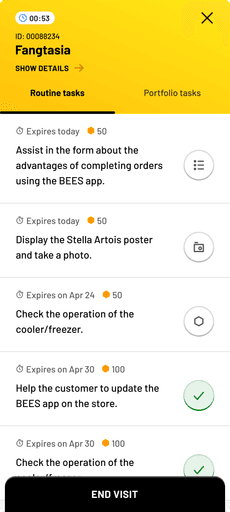
By making Routine Tasks and Portfolio Tasks the primary tabs on the POC page, we reduce the need for additional pages and increase the focus on visit-related tasks. The new experience, which prioritizes sales-focused tasks, improved feature discoverability by 20%*.
*At the start of the process, we interviewed five users who later participated in usability tests. The previous design revealed that only three out of five interviewees (40%) were aware of the portfolio tasks list within the app. After the redesign, usability tests showed a 100% task success rate on locating the same tasks.
Reviewed hierarchy
As we streamlined the experience to be more task-focused, I relocated other access points to more appropriate locations.
By centering the page around tasks, I streamlined the user experience, keeping the focus on their job during customer visits.
To enhance the experience, the header features a sticky version to optimize screen real estate.
More information
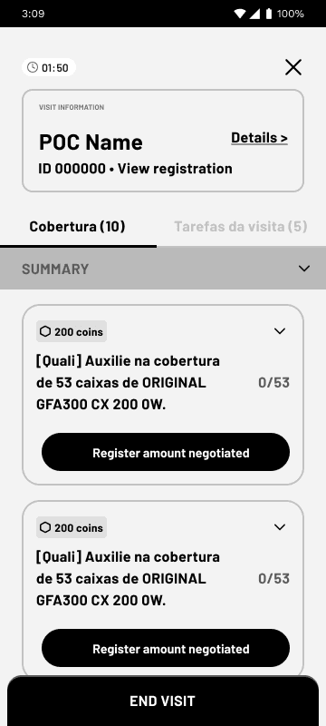
Redesigning the task cards was crucial for improving usability. I replaced the slide-to-complete interaction with a more intuitive approach, transforming the task list into a straightforward to-do list.
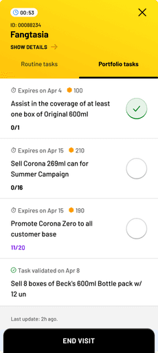
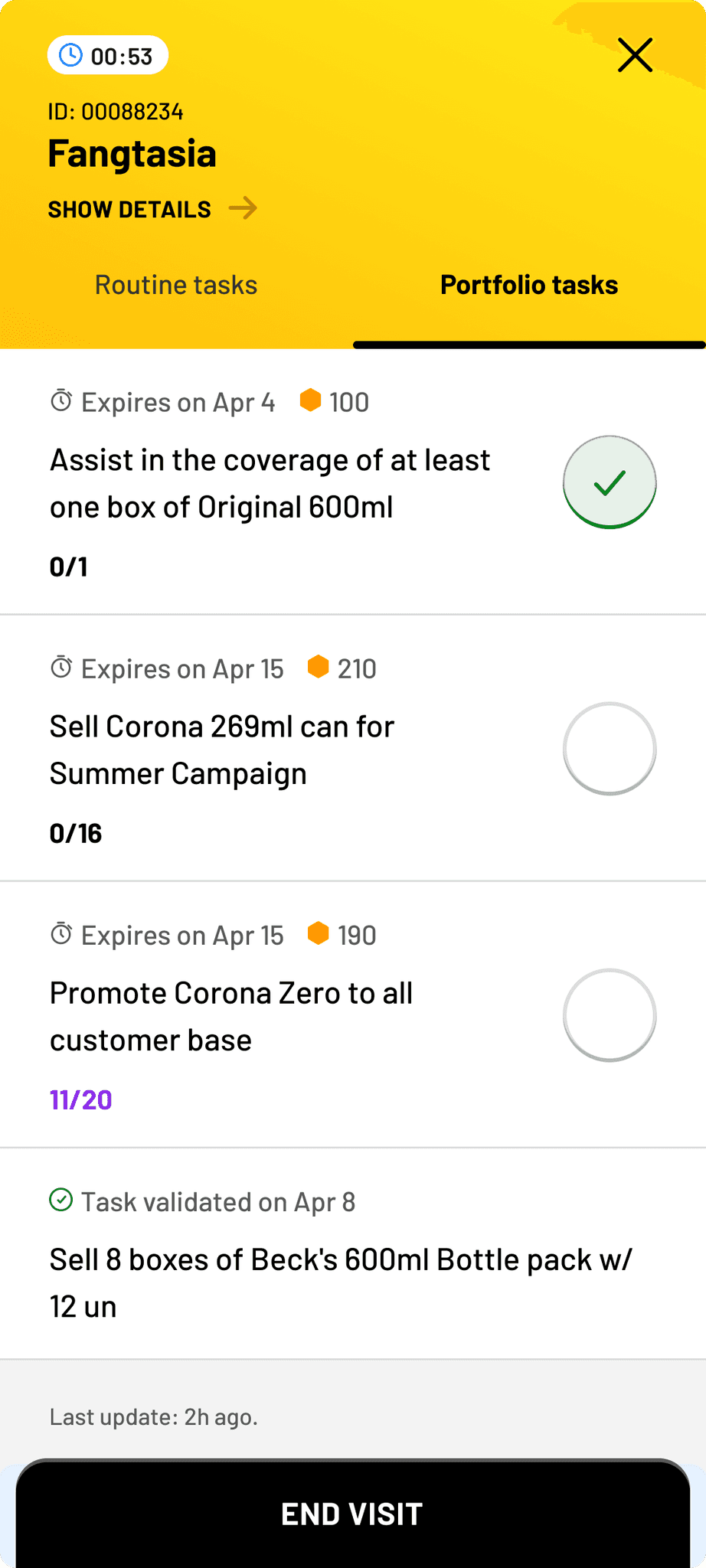
Additionally, I incorporated more detailed task completion information, allowing BDRs to track their actions during each visit. Originally, portfolio tasks lacked a completion interaction, but I discovered that BDRs relied on personal notes to track negotiated products. To address this, the redesign introduced a consistent interaction model across both task types, ensuring a seamless and intuitive experience.

Routine tasks card
Previously, users lacked clarity on task execution periods—some were monthly, others tied to specific visits. Adding an expiration date resolved this.
Task instructions, set in the back office, allowed 120 characters, but I limited them to 60 for clarity.
The completion button replaces slide to complete and now specifies the routine task type: photo, survey, or simple.

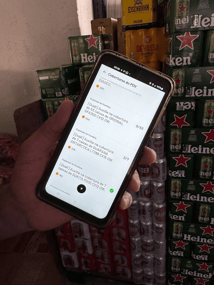
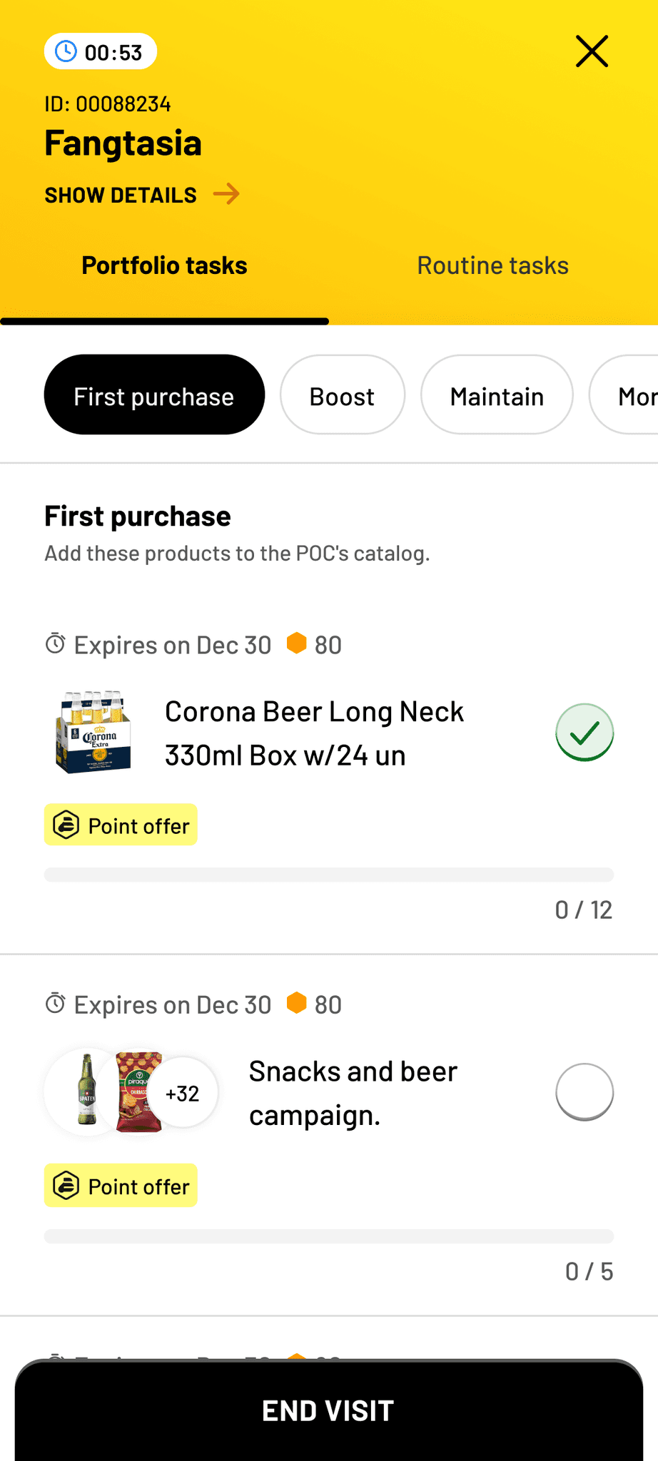
Portfolio tasks card
✷ Phase 02 – Dec 2024
How can we further improve this feature to offer better negotiation tools for our BDRs?
Solution
For the initial release, we focused on enhancing task interactions and kick-starting negotiation tools for BDRs. Now, we aim to further improve their negotiation resources by increasing access to promotions and product details directly from the task list.
The goal for phase 2 was to further improve the portfolio tasks and unlock an even greater potential for BDRs to negotiate products when visiting a customer.
From the old version to the phase 1 and 2, here's a preview of the evolution:
I can show you more! Let's setup a meeting. ☻
✹