VERIZA – APP
2021
Fintech for a social cause
CONTEXT
Numerous Brazilian small entrepreneurs lack bank credit access, a situation we aimed to transform.
Veriza is a fintech dedicated to providing credit to over 30 million Brazilians who are ineligible for loans from traditional banks and institutions. My team and I brought this project to life, guiding it from initial sketches through final design and multiple iterations. Up to this point, Veriza has secured substantial investments to fuel its growth as a startup.
USER PROBLEM
Veriza tackles the problem of financial exclusion in Brazil, where millions of people can’t get loans from traditional banks because of strict requirements. Without options, many are stuck turning to high-interest or unreliable lenders. Veriza steps in to provide fair, accessible credit, helping these individuals take control of their finances, build better opportunities, and improve their quality of life.
Veriza helps small business owners in Brazil access fair and reliable credit, enabling them to overcome financial barriers and grow their businesses.
Business Goals
Compete against big banks' monopolies and build a fairer market.
Attract investors and engage in mentorship programs to drive growth.
Expand within the 25% of Brazilian small entrepreneurs already using digital fintechs.
IMPACT
~1.000
Loans granted throughout the first year.
~R$1.5mi
Raised by 364 investors on Captable crowdfunding.
I collaborated on this project at Novatics alongside a two UX Design peers. I had the opportunity to work on both mobile and web platforms, designing the landing page and internal app flows.
BACKGROUND
Fintechs and traditional banks usually overlook micro-entrepreneurs, which means many end up stuck with high interest rates or can’t get credit at all. According to IBGE (Instituto Brasileiro de Geografia e Estatística), there are over 30 million informal entrepreneurs in Brazil, and most struggle to find fair or safe credit options. A lot of them end up turning to informal loans, which come with big risks and sky-high rates.
Veriza has a smart fix for this: group microcredit where tthree people team up to make credit analysis easier and bring down costs. With this approach, called “solidarity backing,” default rates and interest charges are much lower compared to other loan options.
Discovery
Veriza came to Novatics early, and their team had already conducted some user interviews and product validation.
CSD matrix
We began the process by interviewing the team and stakeholders with two main goals: to deepen our understanding of their knowledge and to identify new product requirements. Through a combination of semi-structured interviews and a CSD matrix workshop, we uncovered the following insights:
The business model focuses on offering group loans to ensure payment and provide lower interest rates.
The loans would operate as microcredit, with a maximum amount of approximately R$1,500.
Veriza had to deliver a seamless user experience to build trust, as the fintech sector can be challenging to navigate due to the prevalence of scams.
Benchmark
The fintech industry is highly competitive, with several established players dominating the market. While Veriza stands out with its unique concept and model, our goal was to design an experience that matches the quality and familiarity of leading fintechs.
Our research focused on the UX of fintechs, particularly digital banks, while also exploring a broader range of UI designs across various financial products. This process resulted in a comprehensive list of references and requirements for Veriza.
DEFINE
Business model
The traditional way: big banks will check your credit score and make you put up something valuable like a house as collateral.
Veriza's way: a group of three people must apply for microcredit together, where each person acts as a payment guarantee for the others.
Personas
The target audience was specific: low-income individuals aged 40 and older, many of whom had little to no experience with digital processes, and some didn’t even own a personal computer. Additionally, research showed that at least 25% of Brazil's economically active population do not have a bank account nor are familiar with online banking.
Because our demographic isn't broadly digitalized, the product team had a hypothesis that they fear digital processes and often question the veracity of digital banks.
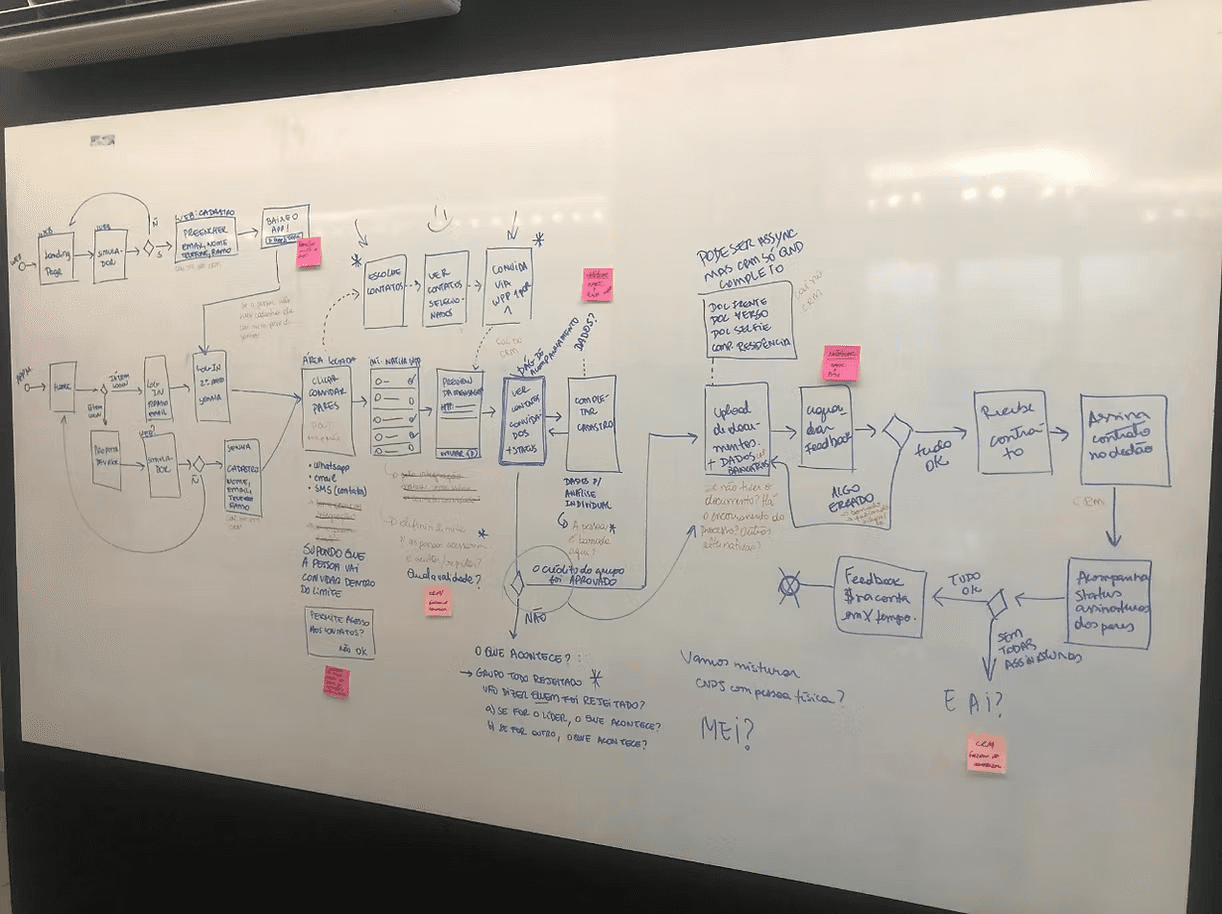
Mapping the journey
After collecting enough research data, we began to design the Veriza experience. We used a map to gather feedback from stakeholders and the engineering team before moving on to wireframes.
In Veriza, we have two main journeys: the group leader and members. The first role is responsible for creating a microcredit group through the platform, and the latter are the members invited to an existing group.
Through fast hand-drawn sketches, we could quickly flesh out the previously suggested journey map. With these resources in hands, the validation of business rules and stakeholder feedback was a dynamic process.
Validate
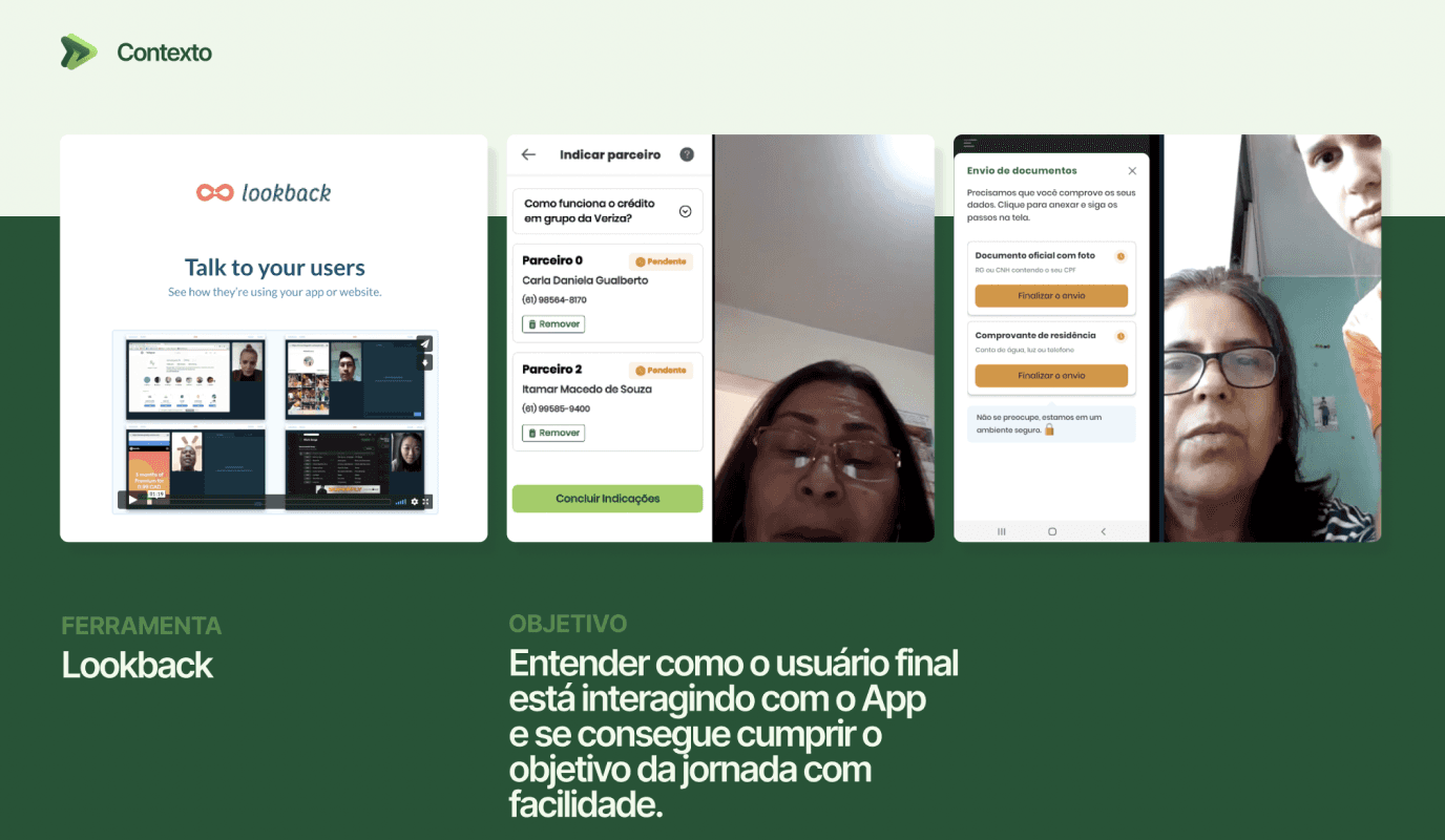
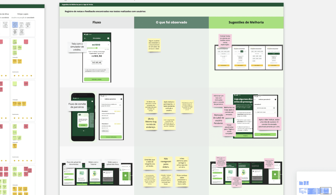
Usability tests
Five months into the project, we had an expo (JavaScript and React) prototyped version for tests. Our goal was to validate user flow, ease of use and the business itself.
Alongside a senior designer, we were responsible for planning and conducting seven 60-minute sessions through Lookback. The entire usability test was planned in Miro to make it a collaborative process with the entire team, from engineers to stakeholders.
7
Participants
78%
overall task success
Insights:
There were a few steps that could be bottlenecks, such as uploading proof of address when you don't have a place attached to your name.
A couple of participants asked for help to someone near them during the sessions. It's safe to assume that our users will likely do the same, so how can we adjust the experience to be more straightforward?
Overall, all users were pretty familiar with the process and required information. Referencing digital banks was key to our success.
The principal hypothesis was that "users don't have familiarity with tech gadgets to use an app." But our research showed that it was more complicated than that. Users did have problems interacting with their phones, but they also didn't trust an entirely digital process. Especially one involving money.
Research also showed that most users wouldn't go through the process alone. And that they weren't willing to team up with strangers like the app initially intended to, there had to be a trust factor.
How might we leverage digital resources to provide fast microcredit to clients who are typically deemed unqualified by traditional financial institutions?
Solution
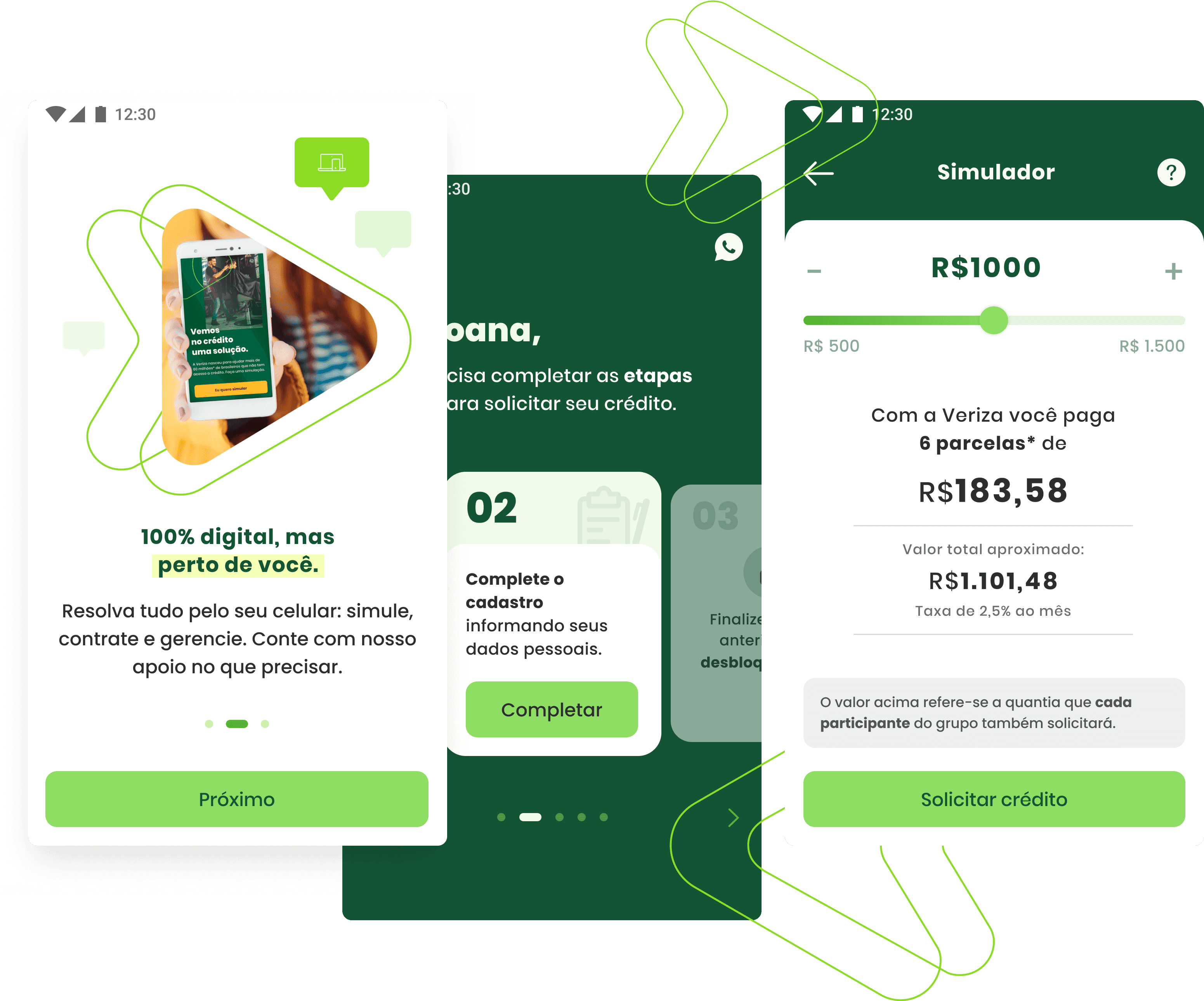
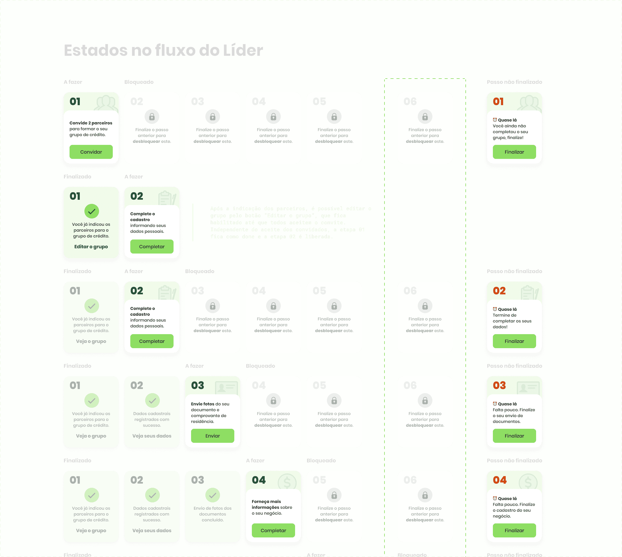
Our users find it hard trusting digital processes, transparency is key. There are several steps involved in requesting credit, the goal was to keep the user aware of the next step. With the large amount of forms to be filled and information that users need to send to access credit, we decided to create a linear experience. Focusing on one action at a time. The solution focused on three pillars:

Accessible language
The research and personas studies showed that our users had difficulty understanding technical terminology. In addition, they prefer visual information rather than textual.


Streamlined experience
Our users find it hard trusting digital processes, transparency is key. There are several steps involved in requesting credit, the goal was to keep the user aware of the next step.


Visibility highlight
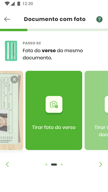
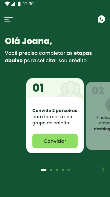
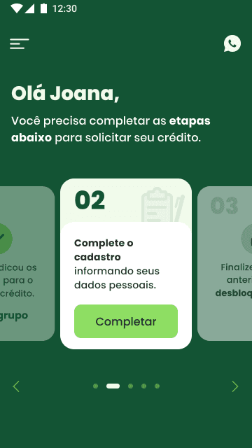
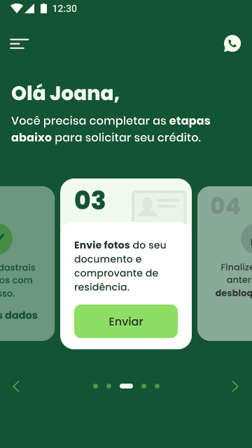
Since users need to fill out multiple forms and submit various documents to access credit, we designed a streamlined, step-by-step experience. By focusing on one task at a time, users are guided through the process with interactive cards, each outlining a specific action—like uploading documents or signing the contract—bringing them closer to credit approval.
✹